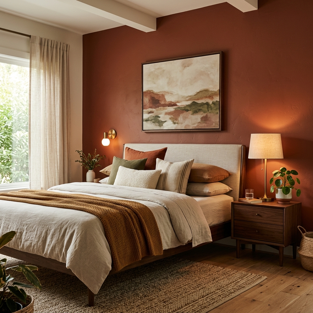

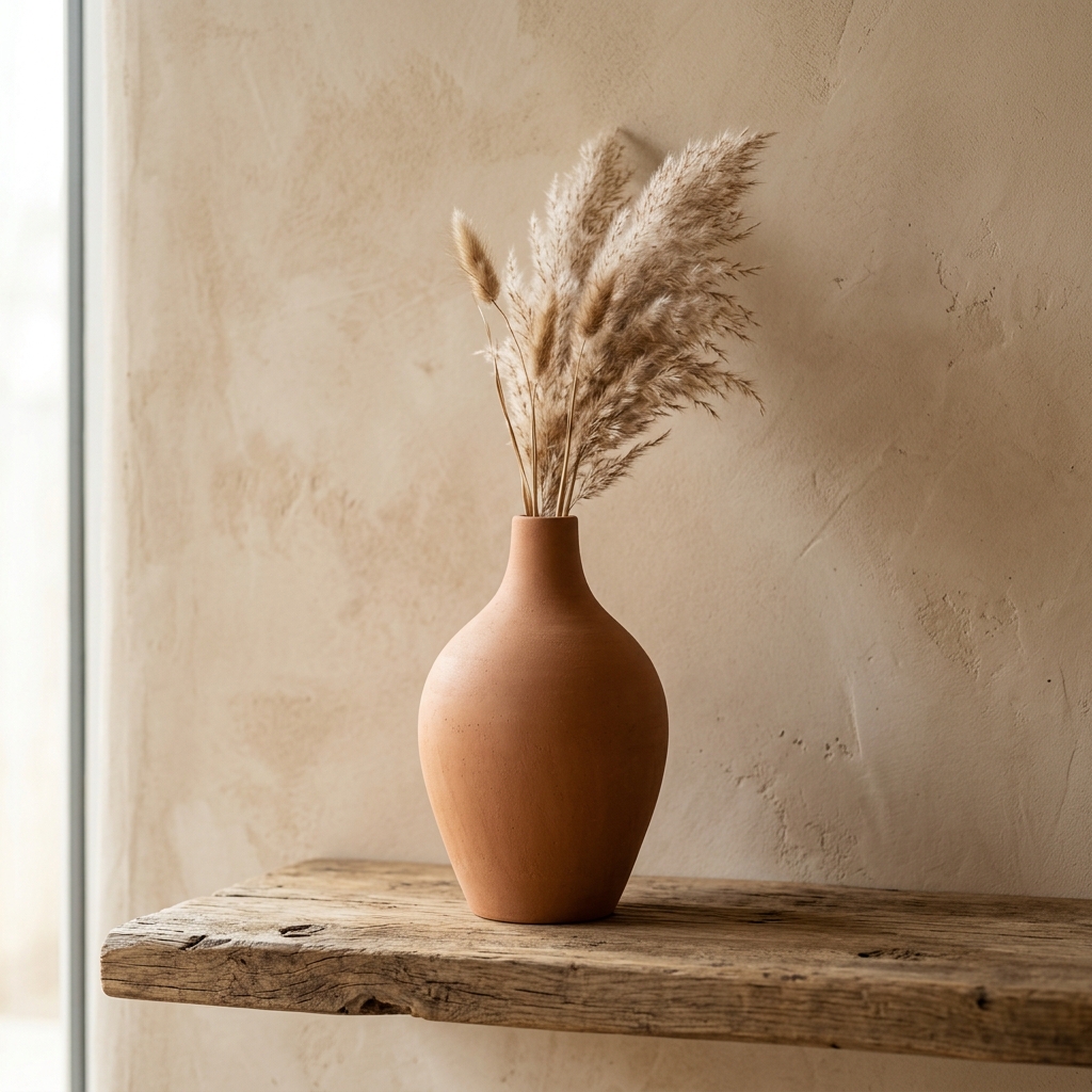
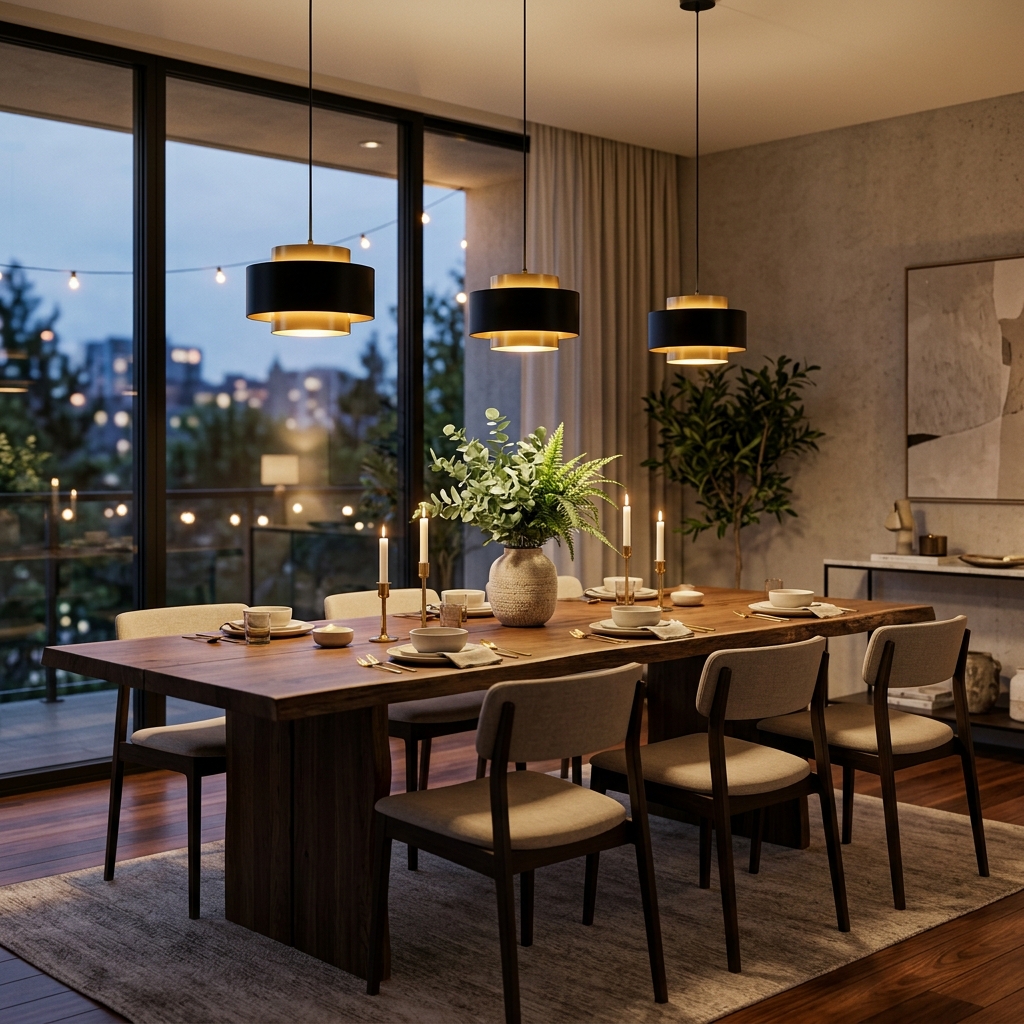
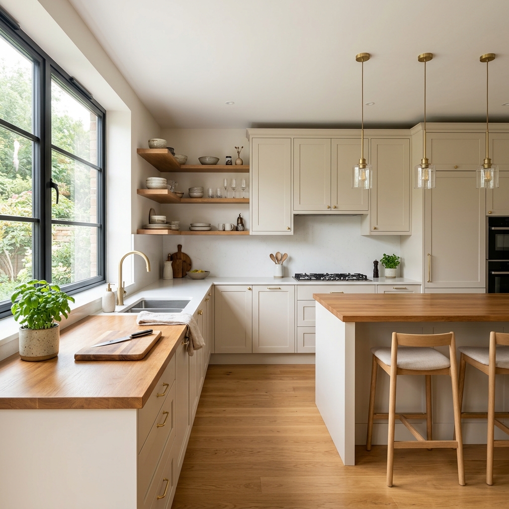
Color does far more than decorate a room — it shapes how you feel in it. Warm tones like terracotta, burnt orange, and golden yellow stimulate energy and conversation, making them ideal for living rooms and dining spaces. Cool hues like soft blue, sage green, and lavender promote calm and focus, perfect for bedrooms and home offices.
Shop the Look
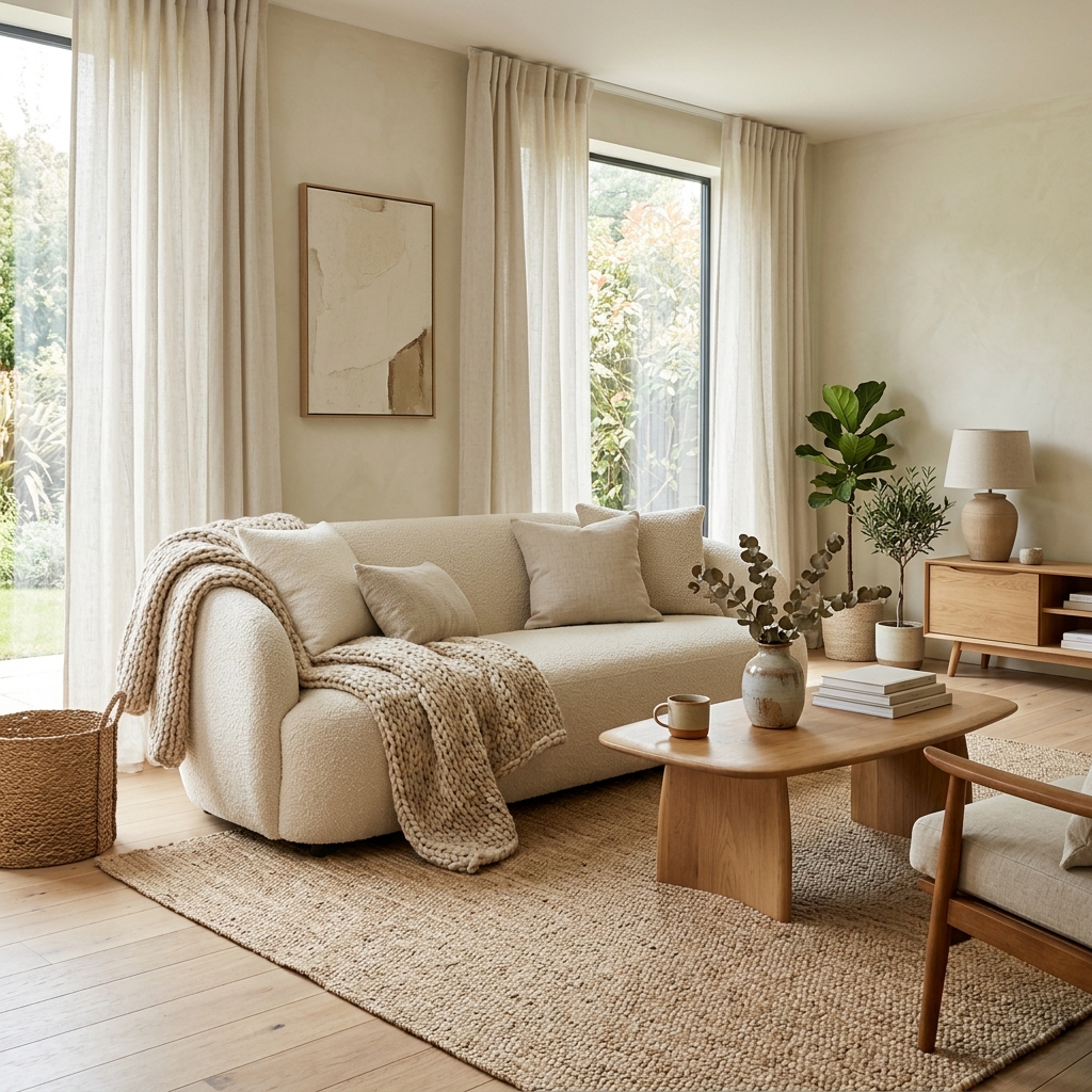
Neutrals are the unsung heroes of interior design. Warm whites and greiges (gray-beige blends) create a versatile canvas that adapts to any mood through accessories and accent pieces. Meanwhile, bold accent walls in deep navy or forest green can add dramatic depth to an otherwise understated room.
Understanding color psychology helps you design spaces that don’t just look beautiful but actually support your daily wellbeing. The trick is balancing your personal preferences with the emotional effect each shade creates.